Color is a very important thing for product image so editors must know how to use complementary colors for color correction of your product images.When it comes to color, it’s in post-production that you’ll have the most freedom. Using Gimp’s “The Difference” filter, you can make your own gradient from any image. You probably already had some experience with color management in editing software like Photoshop, but you may not have considered color harmonies.
I don’t believe this is as simple as it appears, but I hope that delving deeper into it will help you think more creatively about color in your images. In color editing software, you can’t really manage your color harmonies, but you can shift the colors during the image perp. This method appeals to me because it provides me with a fresh perspective on the colors in my images and allows me to concentrate on the shapes and tones that make a good piece.
A color harmony calculator can be especially useful if you plan to use a text overlay on your photo or use design elements to incorporate your image into promotional materials. You can use a color harmony calculator to find complementary colors based on the exact color in your image. You can even arrange colors in a grid by dragging the colors you want to use around with your mouse. The perception of different shades of the same color is something that a color harmony calculator won’t tell you. Doing some research is a great way to assist you in deciding on the best color combination.
Steps to Find find complementary colors for color correction
- Select an area of your photo that contains your main color with Photoshop’s eyedropper tool (I). When you open the color picker, you’ll see the hex code for that color.
- Now go to your preferred color harmony calculator. (Canva’s is one of our favorites!) Choose “complementary” as your desired harmony. Fill in the hex code for your primary color. The complement code will be provided by the calculator. This is useful because you can use Photoshop or GIMP to apply a complex or geometric color as your main color (or its complementary), and if it looks bad, you know the colors need to be improved.)
- When choosing a text color, you can now enter that code into the hex code field. You can, however, overwrite the format—that is, change the colors while keeping everything else in your color code.
You can read more about color correction for product photography
5 Use Of Complementary Color That You Should Know
Combine Red and Green
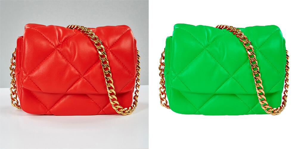
Finding a green and red combination in your surroundings is a simple task. This is a simple color scheme that goes with almost anything! Because green and red are the same color in the HSV color space, they contrast beautifully.
Combine Orange and Blue
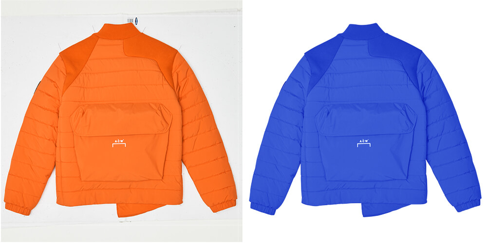
Any orange object against a blue background creates a stunning complementary image. It will be difficult to find a color that compliments orange better than blue. The blue lupine, for example, is the only orange flower that matches its surroundings perfectly (Lupinus perennis).
Combine Green and Purple
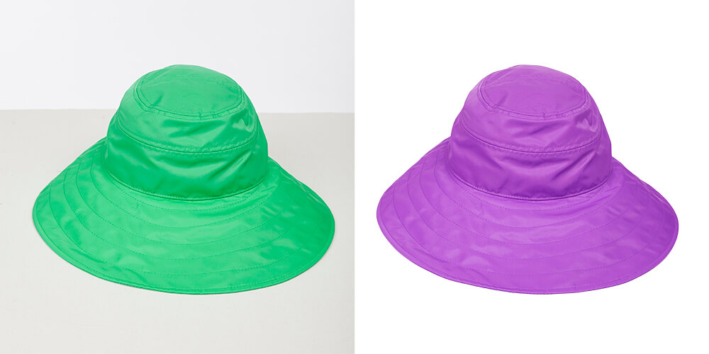
Deep dark green shades should be combined with rich purple. With saturated purple tones, mint and sage will also look fantastic. They’ll appear as if they’re made of gems, making them stand out.
Combine Red and Blue

It will give the image a more modern feel, as well as more energy and freshness. You must work carefully with red if you do not want to be disappointed by the results. It’s worth noting that it appears the most saturated on camera sensors. Don’t go overboard, especially when it comes to saturation. In general, the more saturated a picture appears, the better it will rank for important pages on Google. As a result, red is the color of choice for most people.
Combine Yellow and Purple
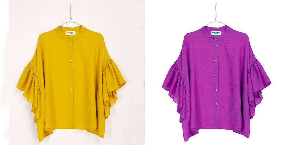
If you want to catch the eye of the viewer, a splash of yellow will help. Purple is the color that is opposite yellow on the complementary color wheel. For fashion photography and color blocking experiments, this combination is ideal. Such images appear to be incredibly bright, playful, and contemporary. Purple is also a fantastic color to use in patterns and floral designs.
About UK Clipping Path Color Correction Solutions
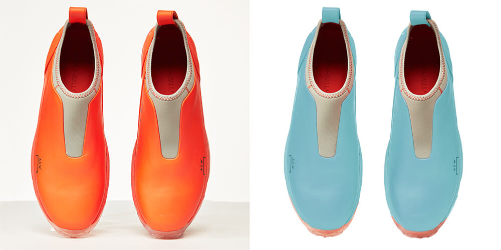
We have over ten years of experience in the image editing industry and are well-versed in the process of color correction. Our experts collaborate with you at every stage to ensure that your images are professional, appealing, and realistic. To provide you with the best service possible, we use all of Photoshop’s color correction techniques. To see how good our color correction service is, sign up for a free trial.


